This is going to be the first of a number of relatively short posts about high health care costs in the US. They are by no means intended to be comprehensive. The graphs are taken from The American Health Economy Illustrated by Christopher J. Conover.
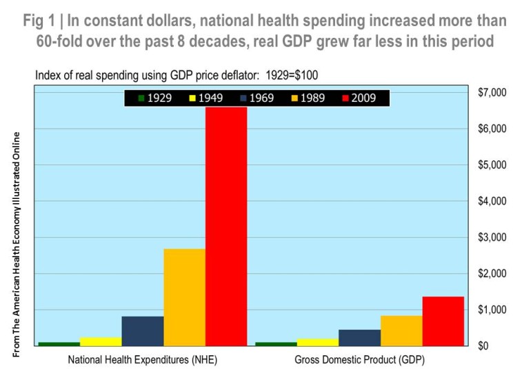
Health care is expensive, especially in the United States. (It’s a good thing you’re reading this so that you can get such non-obvious, hard-hitting analysis!) But how fast is it changing? Since 1929, national health care spending has increased BY OVER 60 TIMES! Looking at Figure 1, it appears that the biggest jump has come since 1989. Certainly, the amount of actual spending increase has occurred during that time, but each of the 20 year increments shows an approximate increase in spending of 2.5 times over the previous era. The actual dollars spent increases significantly in each period, though the relative rate of increase is fairly constant. When I first saw this graph, I was looking for a definitive change since 1989, or maybe from 1949-1969 given the creation of Medicare and Medicaid in 1965, but it’s about the same. That doesn’t mean that spending isn’t increasing, especially when you look at the right side of the graph—real GDP. It certainly is increasing as well, quite a bit compared to the rest of the world. Real GDP increased by roughly 10 times over that same period, as compared to the 60-fold increase in health care spending. What exactly does that mean? It means that we feel the increase in health care costs much more because it grows a lot faster than our nation’s (and especially individual’s) earnings.

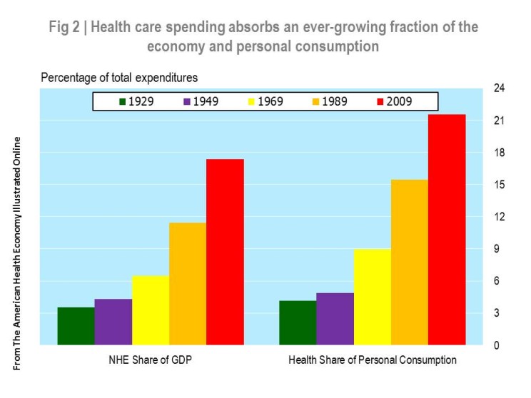
Looking at Figure 2, you see this even more. How much money we spend on health care as a society is taking up an increasing amount of our total spending, but it’s even worse when we look at how much we spend on health care as a fraction of our personal consumption. (There is a discrepancy because only about 70% of GDP is accounted for by personal consumption expenditures [PCE].) Not only do we spend more money on health care, but we spend more of our paycheck on health care, too.

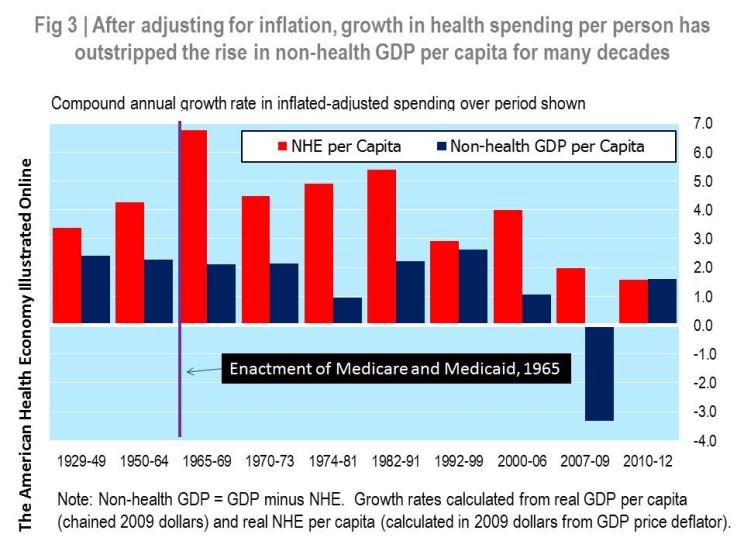
Not surprisingly then, we see the largest margins of health spending per capita as compared to GDP per capita during years of increased governmental financing of health care, or years of lower GDP growth (Figure 3). I’ll discuss more about why the government’s role in increasing health care costs at another time, but this is just another illustration of how we are paying more and more for health care, no matter what happens with the GDP (there is some slow down during recessions, but health spending still almost always grows more than GDP).

Note that I am not an economist, and so there is MUCH MORE in depth nuance that can be had on this topic. For further reading, consider the above mentioned The American Health Economy Illustrated, looking into the writings of Victor Fuchs and Uwe Reinhardt, reading The Incidental Economist blog, or the journal Health Affairs, among MANY others.
